I can’t even remember how many times a little cousin or friend showed me one of their doodles, and every single time I would go “Wooooow, this looks awesome!” while in my head just two things kept resounding – what is this drawing supposed to represent? I’ll just be a good respectable adult and pretend that I know.
Dave DeVries, apparently, doesn’t have this issue.
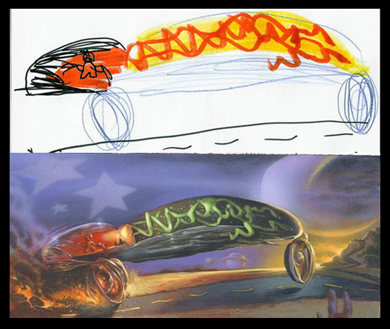
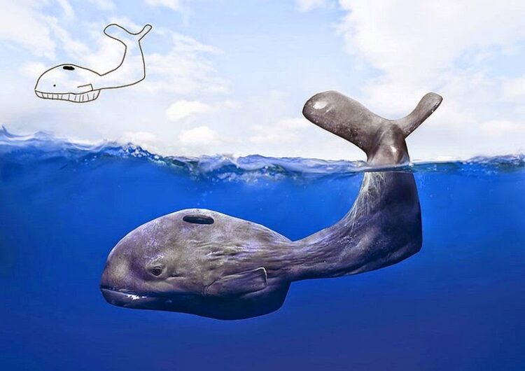
The artist started getting interested in transforming children’s drawings in 1998, when his little 7-year-old niece used to doodle on sketchbooks. That’s when he started wondering what those lines would have looked like, had they been more accurate.As he says, “The process is simple. I project a child’s drawing with an opaque projector, faithfully tracing each line. Applying a combination of logic and instinct, I then paint the image as realistically as I can. My medium is mixed primarily acrylic, airbrush, and coloured pencil.”
And that is how bunches of overlapping confused lines turn into scarier monsters or futuristic (super fast!) cars. Dave also gathered all his illustrations (the children’s initial draft and his adjusted version) in his book The Monster Engine. Luckily, most of the pictures are available online, and these are our favourites.
