Anton Chekhov’s significance in modern theater lies in his attention to the understated moments of human life. His plays rarely rely on dramatic resolution, instead unfolding through pauses, emotional hesitation, and the quiet presence of the natural world. Over time, this sensitivity has often been flattened by theatrical conventions that emphasize seriousness and historical weight, turning Chekhov into a symbol of tradition rather than an ongoing inquiry into how people live and relate to one another. Developed by designer Ming Cheng, this identity for a Chekhov-inspired theater institution begins by returning to that original attentiveness.
This identity for a Chekhov-inspired theater institution begins by returning to that original attentiveness. Rather than approaching Chekhov as distant or monumental, the branding frames his work as intimate and present, grounded in everyday emotion and observation. This shift in perspective establishes the foundation for a visual language that values calm, openness, and restraint over theatrical display.

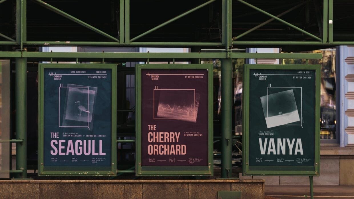
Nature plays a subtle but essential role in Chekhov’s writing, where landscapes, seasons, and physical environments quietly mirror inner states. Responding to this, the visual system introduces organic references such as branch-like forms and imagery that feels weathered and alive rather than polished. A restrained, calm color palette reinforces this atmosphere, echoing the quiet emotional temperature of the plays and encouraging a slower, more reflective mode of engagement.
Chekhov’s relationship to language offers another point of transition. His writing is precise and economical, shaped by the limitations and material conditions of its time. The typography reflects this lineage through references to old typewriter forms, grounding the identity in literary history. At the same time, these forms are refined and rebalanced to avoid nostalgia, allowing the system to feel revived rather than archival. The result mirrors Chekhov’s enduring relevance, rooted in the past yet fully capable of speaking to the present.

Perhaps most telling is Chekhov’s tendency to let emotion spill beyond structure, allowing meaning to surface outside of conventional narrative frames. This sensibility is echoed in the treatment of imagery, where photographs are permitted to break beyond paper-like boundaries instead of remaining neatly contained. The gesture is restrained rather than dramatic, but it introduces a sense of risk and openness that aligns with Chekhov’s refusal to fully contain human experience.
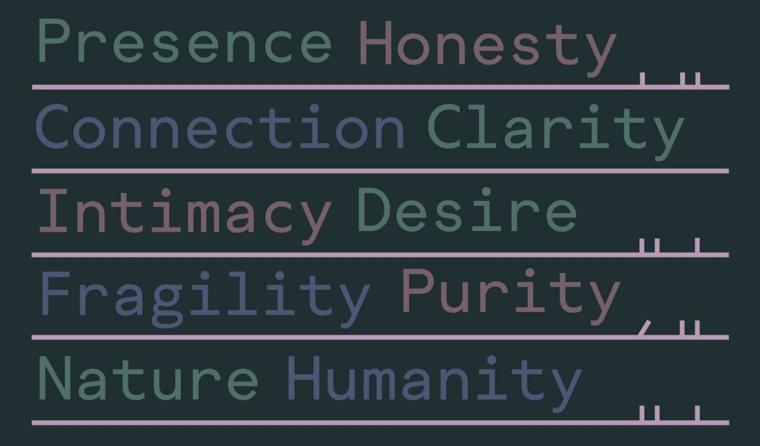
Taken together, these choices position the identity as a considered response to Chekhov’s worldview rather than a stylistic exercise. Visual decisions emerge from literary values, reinforcing themes of presence, fragility, and human connection. Rather than offering a single interpretation, the branding creates space for ambiguity and renewal, framing the theater as a living institution where Chekhov’s work continues to unfold in dialogue with contemporary life.


