A photobook can become more than a simple photo collection. It can tell a story, highlight special moments, and show how memories connect. Creating one doesn’t require design experience. It only needs clear choices, steady planning, and a sense of what the book should share.
With the right steps, anyone can turn a group of photos into something that feels artistic and meaningful.
Pick a Theme That Guides the Whole Book
A strong photobook begins with a simple theme. This theme guides the entire project and helps decide which photos belong. It may be centred on a trip, a family event, daily life, or a creative idea. Some people choose themes based on emotions or visual styles, like shadows or soft colours.
If the goal is to make something that feels polished and purposeful, consider exploring photo books that follow strong themes. They show how clear direction can shape a memorable final product and inspire your own creative choices.
Once the theme is clear, it becomes easier to choose layouts, cover materials, and even the type of soft cover photo book or hard cover you want.
Choose Photos That Support the Story
A meaningful photobook doesn’t include every picture. Instead, it includes photos that support the theme and add depth. Each image should contribute something, whether it’s expression, detail, or atmosphere. Some pictures look great alone, but don’t blend well with the rest. Those can be set aside.
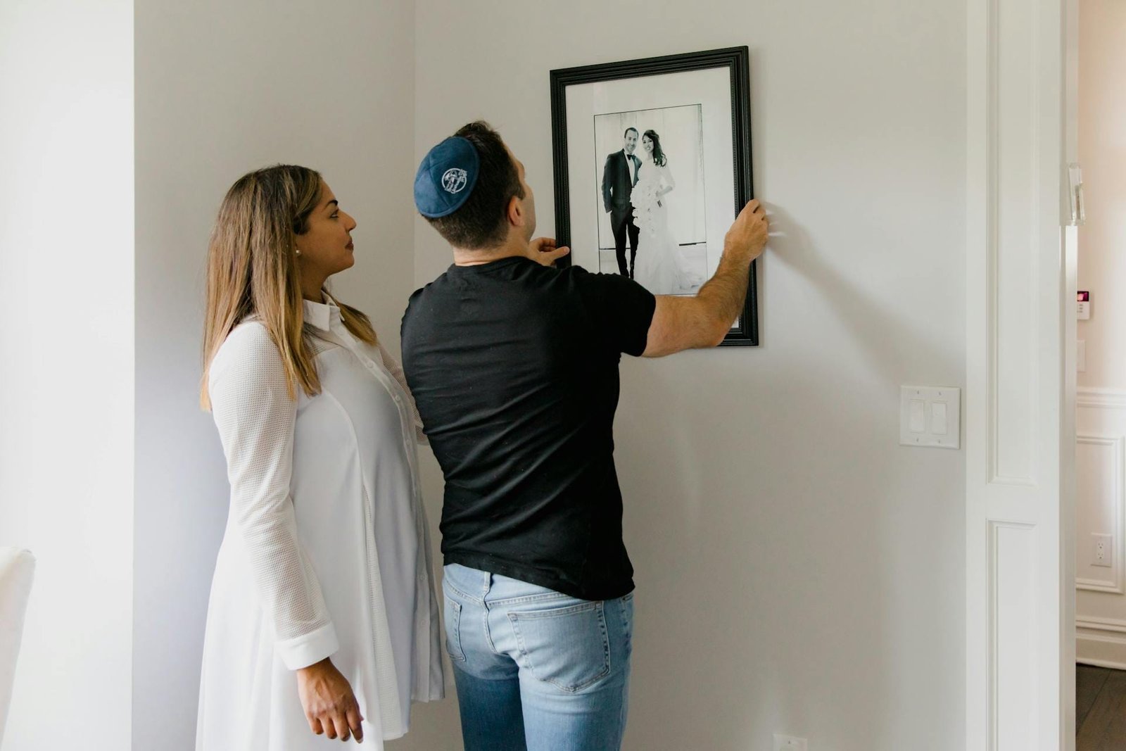
It also helps to consider variety. A mix of wide images, close-ups, and small details gives rhythm and movement. This is especially useful when building something like a wedding album, where a single event has many angles and emotions. Removing duplicates or repetitive shots also makes the final book easier to enjoy.
Arrange Photos in a Way That Feels Natural
The order of the photos shapes the viewer’s experience. A smooth flow can turn simple images into a story that’s easy to follow. Arranging them in a gentle sequence helps the viewer move through the book without confusion.
Some people build the flow by matching colours or textures. Others create contrast by placing a calm moment next to a lively scene. It’s also helpful to place simpler images between strong ones so the viewer has space to pause. A clean photo layout makes each page feel intentional.
When arranging photos, think of the experience as a visual walk. Each turn of the page should feel steady and natural.
Use Layout and White Space to Shape the Mood
Layout choices play a big role in shaping the mood of a photobook. White space, margins, and photo placement influence how the viewer reads each page. White space isn’t empty space. It gives photos room and draws attention to the right spots.
A single large image can feel very strong on a page with generous space around it. A grid layout works well for showing related moments, especially in books built from design templates. Choosing a few simple page layouts and repeating them helps the book stay consistent and calm.
Premium papers also make a difference. Options like semi-gloss paper can bring out vibrant colours, while matte finishes can create a soft, elegant tone.
Pick Colours, Fonts, and Materials That Match the Style
Design elements should match the mood of the book. This includes fonts, colours, and cover materials. A soft cover photo book can feel casual and warm. A hard cover option often feels more formal and suits books created for gifts or major life events.
Fonts should stay simple and readable so they don’t distract from the images. Captions can explain a date or place without taking attention away from the photos. Colours also matter. Soft backgrounds keep a calm mood, and neutral tones help bold photos stand out.
If you’re using a photo editor, it helps to adjust brightness and contrast in a consistent way before placing images in the book. This creates a cleaner and more balanced look.
Add Text Only When It Helps
Text can help tell the story, but too much can interrupt the visual flow. Short captions work well. They can describe a location, a feeling, or a moment. A simple phrase can guide the viewer through a section without overwhelming the page.
Text should support the photos, not compete with them. Keeping it brief makes the book easier to read.
Choose Printing Options That Bring Out the Book’s Beauty
Printing choices shape the final look of the photobook. Paper types, binding styles, and book size all matter. Premium papers can make colours look richer and details clearer. Semi-gloss paper is great for sharp images, while matte papers work well for softer styles.
Binding also affects the viewing experience. Seamless binding allows photos to stretch across two pages without losing details near the fold. This works well for landscapes and wide shots. Size also plays a part. Large books have visual impact, while smaller books feel personal and easy to hold.
Take Time to Review and Adjust
It’s helpful to review every page before printing. Some photos might feel slightly out of place once everything is assembled. Some transitions may feel too sudden. Rearranging photos or adjusting spacing can improve the final result.

Taking a short break and returning later can make it easier to notice what needs fine-tuning. Small adjustments often make the book feel more complete and artistic.
Conclusion
A photobook feels like art when every choice supports the story or mood. Clear themes, careful photo selection, steady flow, and thoughtful design decisions all work together. When the photos, layouts, and materials fit well, the viewer sees more than a simple collection of images. They follow a journey that feels smooth and meaningful. Anyone can create a photobook with an artistic touch by focusing on clarity, emotion, and strong visual choices.


