


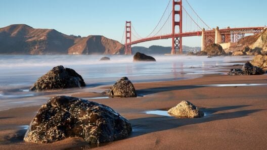
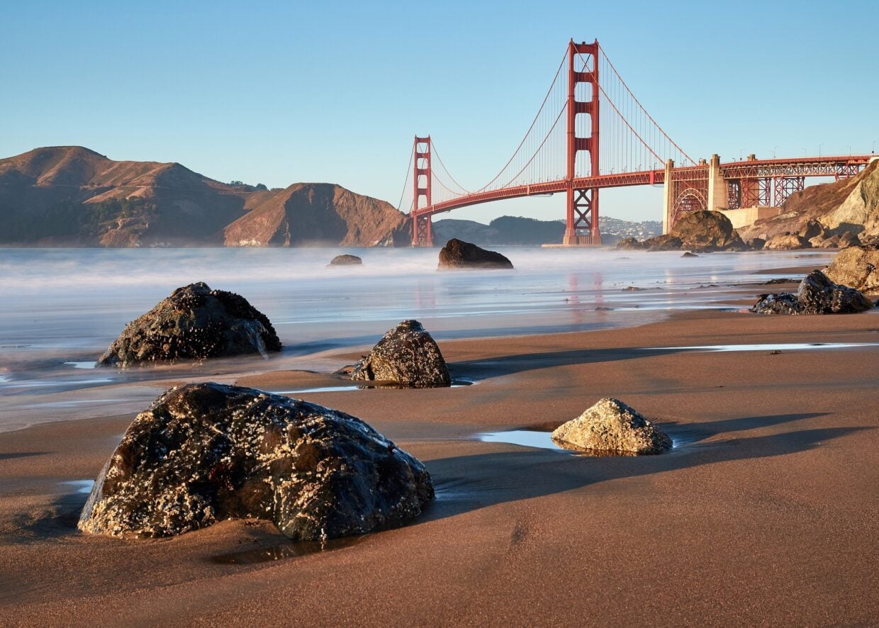

The Golden Gate Bridge is orange because its steel arrived in red lead primer and architect Irving F. Morrow liked the colour. He made International Orange his specification after colour studies and set out his case in an April 1935 report, the Golden Gate Bridge District says. The US Navy would have preferred black and yellow stripes, the District says.
Bethlehem Steel fabricated the steel at its foundries in Pennsylvania and New Jersey, and the steel was coated with a red lead primer, the District says. As the towers rose, Morrow commuted to the construction site from his East Bay home by ferry and “became inspired by the red lead color”.
Before he joined the project, Morrow was an obscure San Francisco architect who designed houses, PBS American Experience says. Chief Engineer Joseph Strauss hired him in 1930 to design an architectural treatment for the bridge.
PBS says Morrow rode the ferry home to Oakland every night. That gave him time to study light and shadow where the Pacific Ocean, San Francisco Bay, the city and the Marin hills meet.
The April 1935 report
Morrow set out his colour case in his Report on Color and Lighting. He wrote the report to Chief Engineer Joseph B. Strauss on 6 April 1935, the District says.
In the colour section Morrow started with a question of policy. “Preliminary to discussion of particular colors, a decision must be made on a matter of policy,” he wrote. The choice was whether “to emphasize the bridge as an important feature of the landscape, or to make it as inconspicuous as possible.”
His colour studies “resulted in the specification” of International Orange, the District says, because it blended well with the nearby hills and contrasted with the ocean and sky. Morrow concluded, it says: “The effect of International Orange is as highly pleasing as it is unusual in the realm of engineering.”
The studies were carried out with other architects, engineers, painters and sculptors, the District says. Black, grey and aluminium were included and each was ruled out. Black would be unattractive and would reduce the scale of the bridge more than any other colour.
Supporters of aluminium said it would give the beauty of a dirigible, the District says. Morrow rejected it because the towers would be deprived of substance and made tiny. Battleship grey and warm grey were studied, and warm grey was named the distant second to “orange vermillion”.
The sculptor Beniamino Benvenuto Bufano wrote to Morrow that he hoped “the color will remain the red terracotta” because it added to the structural grace.
Stripes and other ideas
The District frames the Navy’s position as a preference. “If the U.S. Navy had its way, the Bridge might have been painted black and yellow stripes to assure even greater visibility for passing ships,” the District says.
PBS says others suggested aluminium, dull grey, or “the Navy’s preference, highly visible yellow and black stripes”. In the PBS American Experience film, John van der Zee says: “The Navy felt it should be painted with yellow and black stripes, for visibility. They were still thinking of ordinary bridges.”
The bridge authorities at first deemed Morrow’s selection ludicrous, PBS says, reasoning that no red paint could withstand the salty conditions of the Gate. The film says he tested paint formulas by exposing metal panels to the weather.
Members of the project’s brain trust relented one by one as Morrow identified a paint durable enough to need less frequent reapplication, PBS says. “The tone is beautiful under all light conditions,” said E. P. Meinecke, a U.S. Forest Service pathologist.
The film says Morrow pursued the issue with Strauss until the chief engineer gave in. It says 200,000 people came to the bridge on its opening day, 27 May 1937, to walk, sprint, skate or cycle across. “This bridge needs neither praise nor eulogy,” said Strauss. “It speaks for itself.”
How the colour is kept
As the bridge was built it was painted International Orange with a lead primer and a lead-based topcoat, the District says. The paint protects the steel from salt in the air, which can cause it to corrode.
The District says claims that the bridge is painted once every seven years, or from end to end each year, are misconceptions. It says the bridge is painted continuously.
The colour is mixed to the District’s own formula, which it says is not proprietary. Anyone can formulate and use it, and the District publishes the colour percentages. The CMYK values are zero per cent cyan, 69 per cent magenta, 100 per cent yellow and six per cent black.
Paint is bought through competitive bidding, the District says. It says the paint is currently supplied by Sherwin Williams and made to match the formula, checked against ASTM D 2244. The closest off-the-shelf Sherwin Williams colour is “Fireweed”, code SW 6328.
The District says the present crew is 13 ironworkers, three pusher ironworkers, 28 painters, five painter labourers and a chief bridge painter. Ironworkers replace corroding steel and rivets with high-strength steel bolts, and painters repaint all corroded areas.